CiPU lab
喜室好好 概念店
台北松山區
Feb, 2020
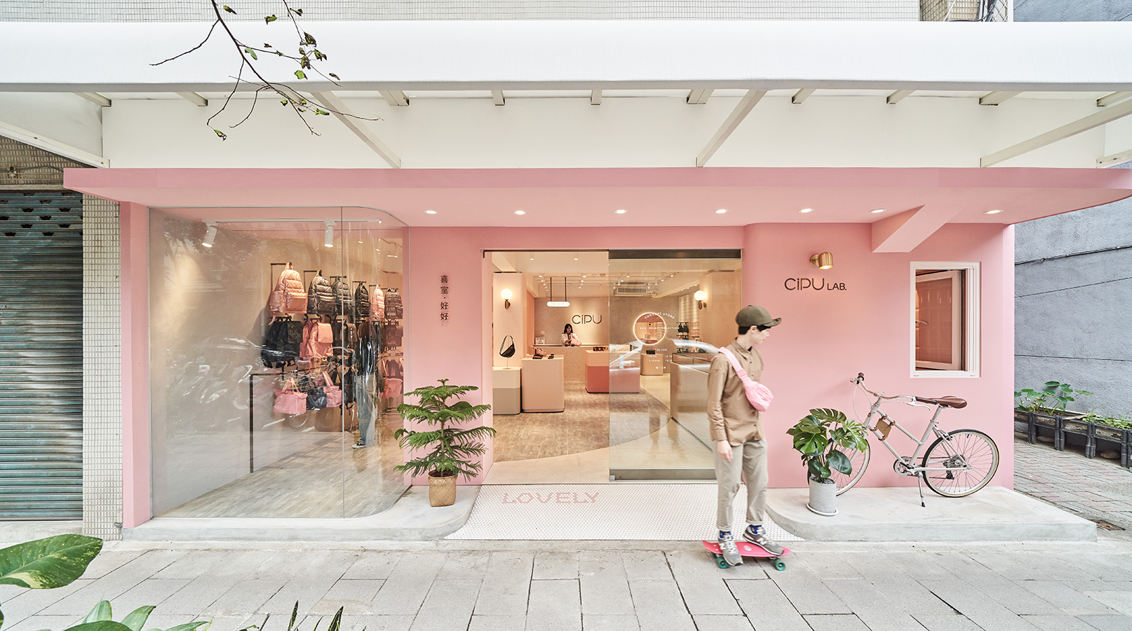
一座甜膩爽朗的粉色店鋪,點亮了綠意盎然的台北民生社區。
CiPU以設計自製的媽媽包起家,在品牌成立十周年,打造了首間概念店-CiPU LAB.
除了自家商品,不定期與各類型商家合作,於店內進駐快閃,賦予店內更多樣的面貌。
“A saccharine pink store stands out in the greenery of Minsheng Community, Taipei.”
CiPU, a famous mommy bag brand founded over a decade, opened up its first concept store –CiPU LAB.
CiPU LAB not only exhibits its merchandise and selections but offers casual pop-up events in cooperation with various types of brands. The shop-in-shop concept gives CiPU LAB a different dimension.


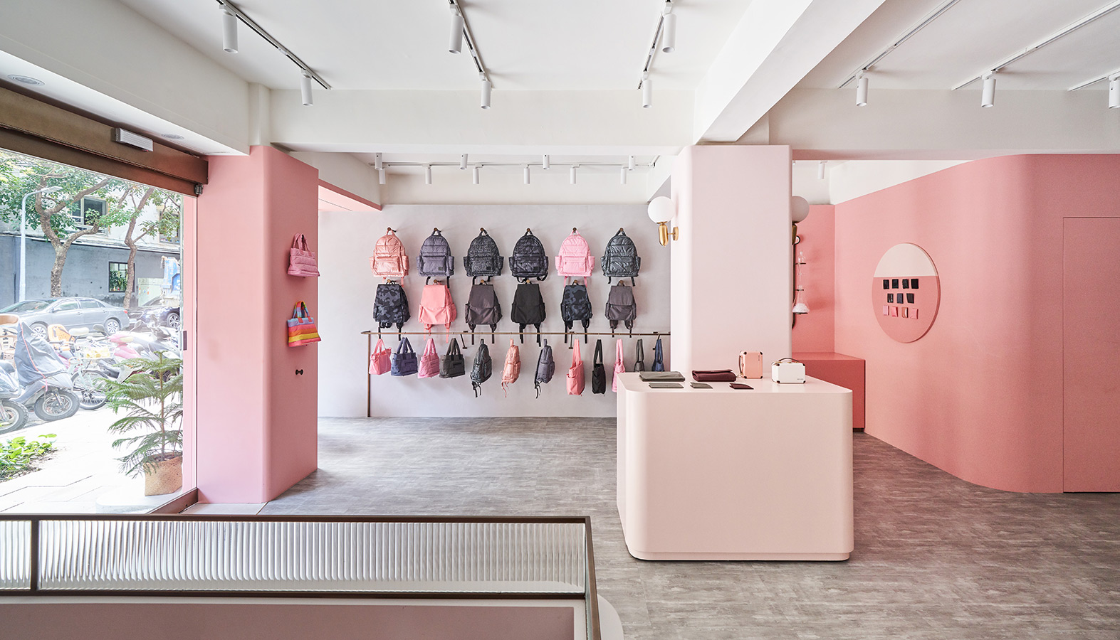
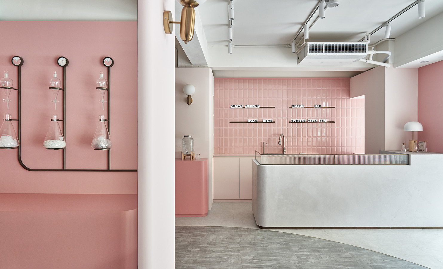
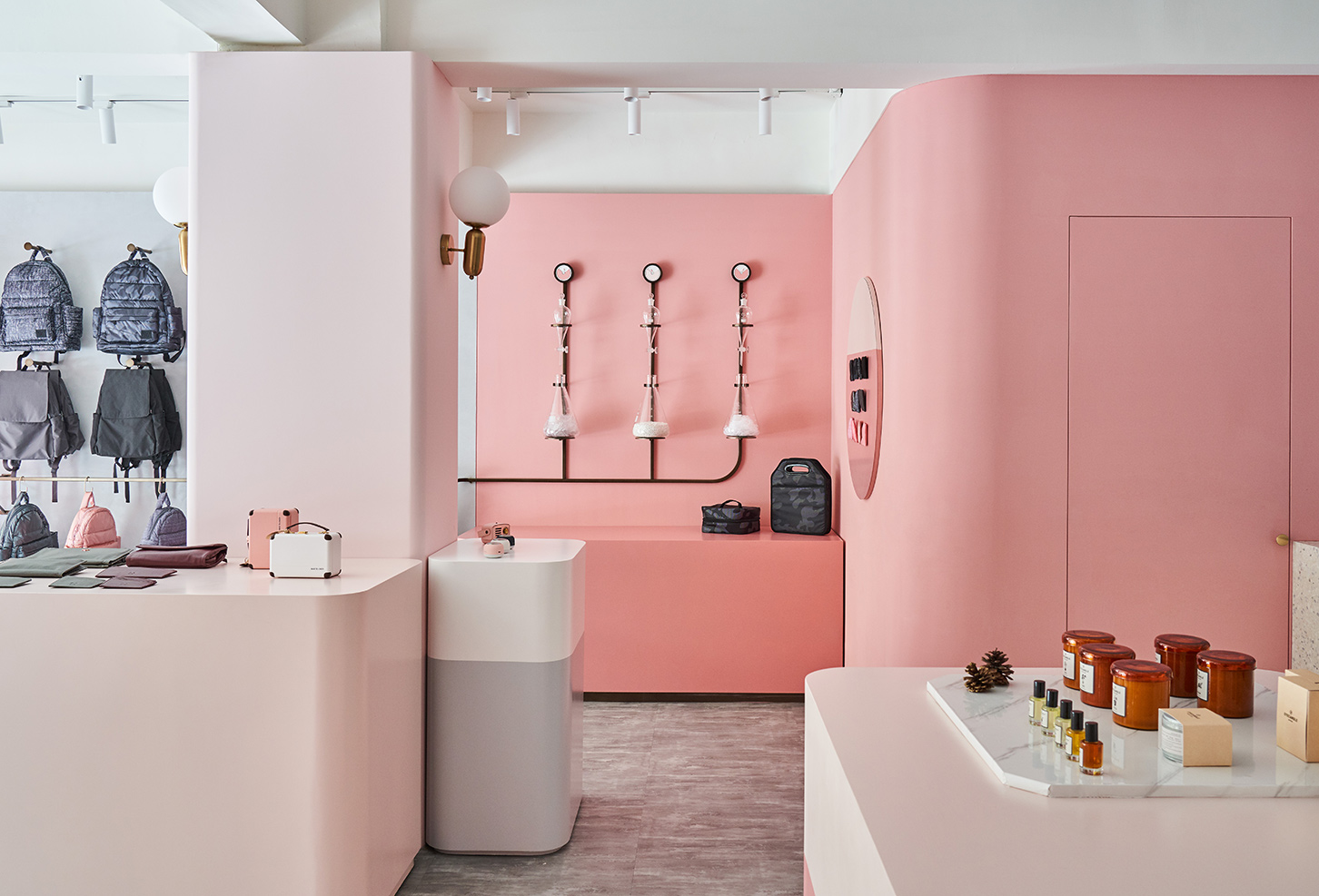
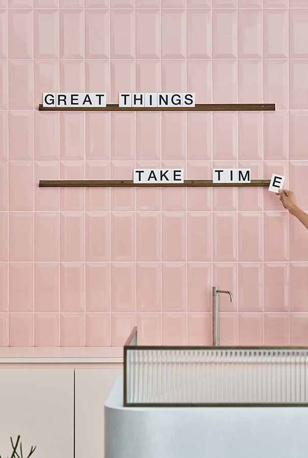
汲取企業色-粉紅色為空間主調,為了不讓過多的粉色讓顧客產生壓迫,
調整出兩種彩度的粉色互相配合,以增添層次;
再運用無色彩的材質做平衡,包含天花壁面灰白色樂土、白色水磨石吧檯以及地坪鋪設的深淺灰色地磚,都讓整個空間宛如夾心餅乾一般,從中襯托起粉紅的可口。
The color palette is the feature in CiPU LAB, with its corporate identity –pink at the heart of the designs. Without being closed in, the pink colors are created into two saturation, giving the space cohesion and layering. The neutral color materials, including grey and white lotos ceiling, white terrazzo reception desk, and dark and light grey tile pavement, lend a backdrop to the pink. The synergy between pink and muted color makes the space as if a delicious cream biscuit.
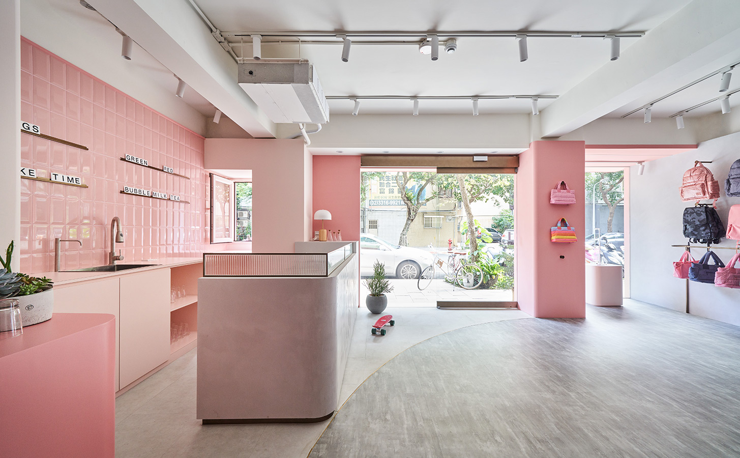

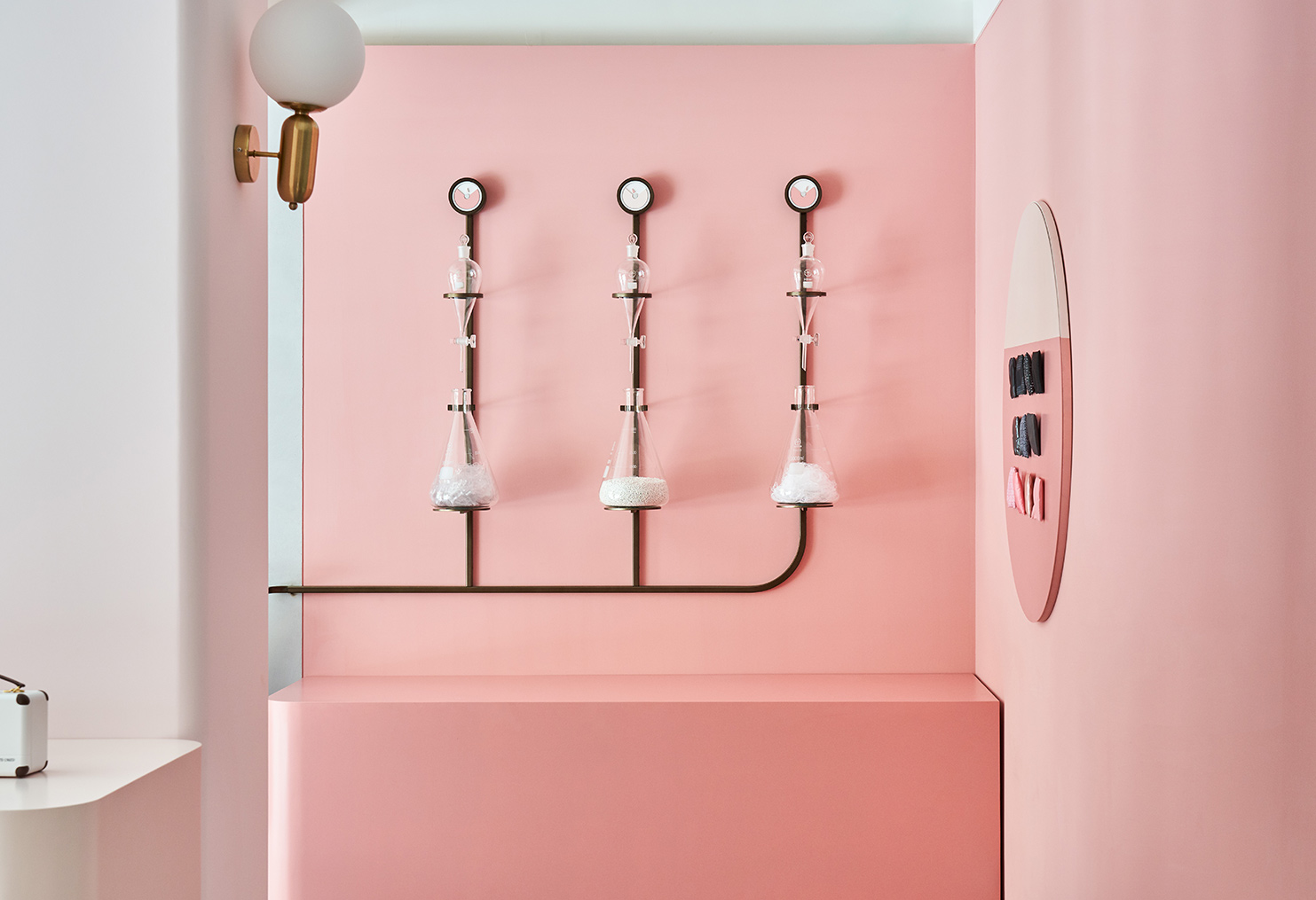
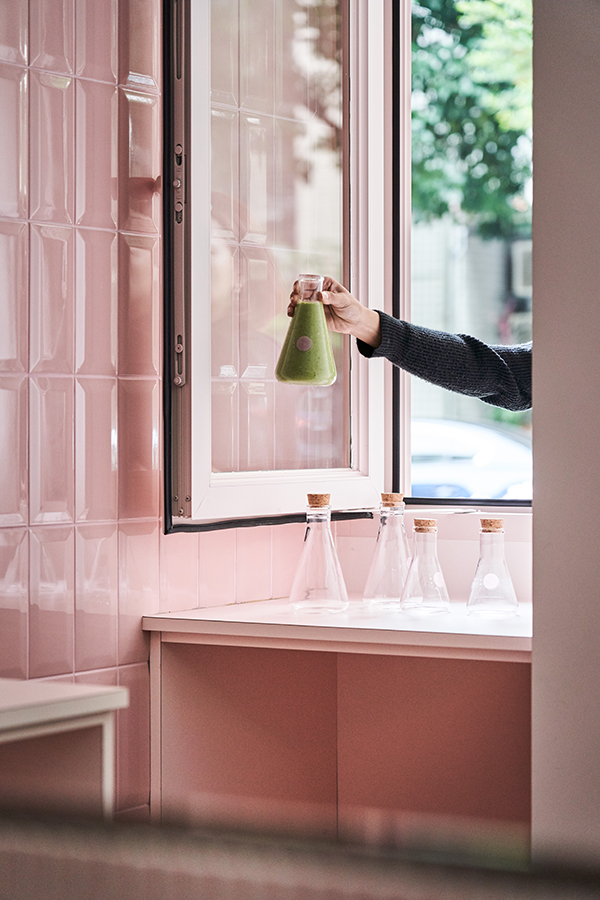
而為呼應「LAB」的實驗室概念,空間置入些許實驗室的元素,
其中一區利用玻璃燒杯展示製作包包的環保原料,連店內飲用的珍珠奶茶,也是用燒杯承裝,
讓概念不時出現點綴,空間也因為這些小驚喜趣味疊加。
The laboratory details in the interior resonate with the “LAB” concept. The display of Erlenmeyer flasks in an area is to showcase the recycled materials of producing bags. Even bubble tea is in the glass flask for customers! The concept echoes in these lovely touches adding wow factors for space.

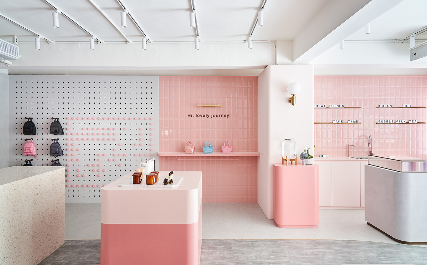
配置上為因應不同商家進駐,空間內部錯落尺寸不一的可移動中島,可根據不同的商業性質任意調整;
牆面上矩陣排列的圓孔,可隨意插入變更掛鉤的位置,也提升了不同商品的陳列彈性,每一次的挪移,彷彿都在空間中碰撞出新的化學效應。
Layout wise, several islands in different sizes are designed interchangeable and adaptable for co-op event usages. On the pegboard wall, the pegs are placed within the holes to display a variety of items. It is also movable to increase the flexibility of merchandise presentation. The design and layout can be changed whenever required, which creating beautiful little firework explosions in the space.


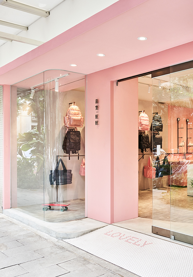

而另人印象深刻的應該就是外觀轉角那面哈哈形象牆
,
原先是為了修飾建築外的凌亂管線而將之整平,
最後將品牌的歡樂精神具象化的引入上牆,數十個「哈」搭配外觀整體包覆的粉紅色,
讓來往的過客都不由自主地被吸引而會心一笑。
The “lol” exterior feature wall on the street corner is another impressive point. The messy pipes on the architecture were the target to renovate originally, but it turned out to incorporate uplifting brand spirit in the wall. The numerous “lol” and upbeat pink color wrapped on the exterior catch people’s eye. Immediately, a smile starts on the lips; a chuckle comes from the belly.


PROJECT
INFORMATION
/
專案名稱 Project:喜室好好 CiPU lab.
專案位置 Location:台北市 Taipei City, Taiwan
使用面積 Area:20坪 / 65m2
空間材質 Materials:噴漆 / 樂土 / 水磨石
設計單位 Design :肆伍形物所 45tilt Design
專案設計 Desiger:陳怡如 / 張恬嘉 /曾慶瑜
攝影團隊 Photography: Hey! Cheese
完工時間 Realization : FEB, 2020